Two major topics:
- Spatial events: visual exploration, spatio-temporal aggregation
- Spatial time series: exploration using partition-based clustering
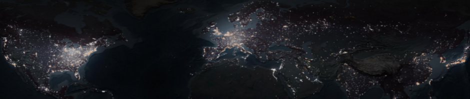
Data: geo-located tweets from London
-
- Spatial events: a sample of tweets from one day
- Spatial time series: tweets from one week aggregated into counts by territory compartments and hourly time intervals
Software: V-Analytics
Topic 1: Spatial events
Plan
- Visual representation of spatial events in a space-time cube
- Exploration of the temporal distribution using a time histogram
- Spatio-temporal aggregation by territory compartments and time intervals
Preparation to the exercise
- Start V-Analytics
- Load project “events.app”
- Menu “File” > “Load project” > button “Browse” > open folder named
(“1”, “2”, or “3”) > load file “events.app” - The events are loaded and shown on a map
Space-time cube
- Visualize the events in a space-time cube
- Menu “Display” > “Space-time cube” > the layer with the events is selected in the list > press button “OK” > a new window with a space-time cube appears
- Observe the spatio-temporal distribution of the events. How did the event density vary over time? Can you see spatio-temporal clusters of events?
- Interactive operations:
- Switch on and off the upper map: checkbox “Show the map on top of the cube”
- Rotate the view left or right: press RMB (right mouse button) and move the mouse left or right
- Move closer to or farther from the viewpoint: press RMB and move the mouse down or up
- Shift left, right, up, down, etc.: press LMB (left mouse button) and move the mouse
- Rotate the view forward or backward: press RMB while pressing Control key and move the mouse down or up
- Reset the view: double-click or button “Reset view”
Time histogram
- Create a time histogram
- Menu “Display” > “Display wizard” > dialog “Select attributes to visualise” appears > select attribute MESSAGEDATE (move it from the left to the right by doubleclick or select and press right-pointing arrow) > press button “OK” > dialog “Select display type” appears > in the right column, select “Frequency histogram” > press OK
- frequency histogram appears
- The starting time moment can be interactively changed (e.g., rounded). The default time step is 900 seconds (15 minutes); it can also be changed.
- Observe and characterise the temporal distribution of the events
- How did the number of events vary over the day?
- In what time periods the event number was the lowest, the highest?
- Where there peaks in the number of events?
Spatial filter
- Activate the filter “Spatial window”
- Menu “Filter” > “Spatial window” > drag the mouse with the left button pressed over the map to create a rectangle, release the button > the data are filtered by the selected rectangle
- The filter can be changed* by mouse-dragging applied to any of the sides, corners, or the of the rectangle. Dragging in a different part of the map creates a new spatial window and erases the old one.
- Change the position and extent of the spatial window and observe
- How many spatial events occurred in different areas (shown in the legend on the left of the map)
- How the events were distributed in time (use the time histogram)
- How the events were distributed in space-time (use the space-time cube)
The interactive operations for changing the filter are enabled when the item “Spatial window (filter)” is active, i.e., marked with a red frame.
- To deactivate the spatial filter: menu “Filter” > uncheck the item “Spatial window”
Time filter
- Activate the time filter
- Menu “Filter” > “Time filter” (at the bottom) > a window with time filtering controls appears
- Interactive operations:
- Changing time unit: click on “seconds” or another time unit label
- Changing the extent of the time window: move the right or left side of the blue slider bar by mouse dragging
- Moving the time window: position the mouse cursor in the centre of the blue slider bar and drag with the mouse to the right (forward in time) or to the left (backward in time)
- Observe on the map how the spatial distribution patterns change when you change the time filter. Were there any spatial clusters or linear arrangements?
- Please note that the time filter operates as a tool for temporal zooming in the space-time cube, allowing to see in more detail the spatio-temporal distribution of events in smaller time intervals.
Spatio-temporal aggregation of events
- Close the time filter window, to clear the time filter
- Divide the territory into compartments using data-driven tessellation
- Menu “Calculate” > “Spatial calculations” > in dialog “Select the analysis tool”, select “make Voronoi polygons around groups of points” (left column, lower part) > press OK > dialog “Select a layer with points” appears, layer “Tweets from London …” is pre-selected > press OK > dialog “Group points” appears > set maximum group radius to 1000 m (if another value is pre-set); uncheck the box “make a map layer with the centroids of the groups”; check the box “introduce additional generating points for Voronoi cells in empty areas” > press OK
- The system proposes a name for a new map layer; you can make it shorter
- A map layer with Voronoi polygons is created
By territory compartments and time intervals
- Activate the event aggregation tool
- Select menu “Analyse” > “Events: spatio-temporal aggregation” > a dialog with 2 list boxes appears > select “Tweets from London …” in the upper list > select the layer with the polygons in the lower list > press OK > a dialog “How to aggregate?” appears; “by time intervals” is selected > press OK
- A dialog for setting time breaks appears; divide the time span of the data into hourly intervals > after the breaks have appeared in the list, press OK > confirm removal of useless breaks > press OK
- In the following sequence of dialogs, press OK (default settings will be used), except the dialog “Compute the number of events in the neighbourhood of each area (…)?” (here press “No”)
- The tool computes time series of event counts for the compartments and puts them in the table associated with the map layer containing the territory division.
Visualization of the aggregation results (spatial time series)
- All possible visualizations for spatial time series are obtained as follows:
- Select menu “Display” > “Display wizard” > a dialog for table selection appears > select table “with the same name as the polygon layer” > press OK > a dialog for attribute selection appears; time-variant attributes (time series) are marked by (T) > select a time-variant attribute, i.e., move it from the left list to the right list (double-click in the list or click and press the right-directed arrow) > press OK
- The system shows the options: Animated map, Map with value flow diagrams, Time graph.
- Open a time graph display with the time series of the event counts.
Interactive exploration of the results
- Links between the map and the time graph:
- Activate the layer with the polygons in the map by clicking on the layer name in the map legend; a red frame in the legend marks the currently active layer.
- Areas of the active layer in the map and curves in the time graph can be selected and deselected by clicking. Selected areas and curves are highlighted in black.
- Using these operations, find the area with the highest peak. What is this area (use map zoom), when did the peak happen, how many events occurred there at that time?
- For some other area containing an observable event cluster, find the corresponding curve in the time graph. At what time dis the highest number of events occur here?
Topic 2: Exploration of spatial time series
- Plan
- Visualization of spatial time series: time graph, 2d time histogram
- Transformation of time series
- Partition-based clustering of places by similarity of the time series; exploration of clustering results
- Partition-based clustering of time intervals by similarity of the spatial situations; exploration of clustering results
- Preparation to the exercise
- Start V-Analytics
- Load project “time_series.app”
- Menu “File” > “Load project” > button “Browse” > open folder named (“1”, “2”, or “3”) > load file “time_series.app”
- A map with territory division appears
- Explanation of the data
- The layer with the territory division has an associated table containing time series of event counts by hourly intervals. The duration of the time series is one week, i.e., 168 ( = 24 x 7) time steps.
- Note: The table is not immediately visible. It can be visualized through menu “Display” > “Table view” (not required for the exercise).
Visualization of spatial time series
- Open a time graph display
- “Display” > “Display wizard” > attribute selection dialog appears; select the time series “(T) N events by hours” > dialog with possible visualization options appears; select “Time graph”.
- Find the times and places (territory compartments) of the highest peaks; locate the places on the map using the link between the map and the graph.
2-dimensional time histogram
- Open a 2d time histogram display analogously to the time graph.
- “Display” > “Display wizard” > attribute selection dialog appears; select the time series “(T) N events by hours” > dialog with possible visualization options
appears; select “2-dimensional histogram”.
- “Display” > “Display wizard” > attribute selection dialog appears; select the time series “(T) N events by hours” > dialog with possible visualization options
- The rows in the histogram correspond to the days and the columns to the day hours. The cells contain summary statistics computed from the time series. The default view shows sums of event counts from all places. Other options include maximum, minimum, average, and count of places with positive values.
From absolute values to relative with respect to the time series means
- In the time graph display, open the tab “Transformation”, find section “Temporal comparison”, press “Change”.
- Dialog “Temporal comparison” appears; select “mean” and “normalise”, press OK.
- For each time series, the system computes the mean M and standard deviation S. Then each value V is substituted by V’ = (V – M) / S.
- Observe the change of the time graph.
- To put the transformation results in the table, use the button “Store transformed data” (extend the time graph window if not fully visible).
Visualisation of transformed data in a 2d time histogram
- Open a 2d time histogram for the transformed time series (note that the table now contains two time series, original and transformed). Select different aggregation options (sum, maximum, count) and compare the histograms for the original and transformed time series.
- Note: for “Sum”, select condition “All”; for “Count”, select condition “>0”
Partition-based clustering of places
By similarity of their time series of attribute values
- Start the clustering tool (it uses the partition-based clustering algorithm k-means)
- Menu “Analyse” > select “K-means clustering” > attribute selection dialog appears; select the time series “(T) N events by hours (transformed)”, i.e., the result of the transformation
- Dialog “Select parameter values” appears. All values of the temporal parameter “hour” are listed on the left. You do not need to select parameter values explicitly, just press OK. When nothing is explicitly selected, all parameter values will be taken for the analysis.
- Dialog “Apply clustering to …” appears: make sure that checkbox “rows of the table”
is selected; press OK. - You receive the following window with controls for setting clustering parameters.
- Run the clustering tool for the default number of clusters k = 3 (press button “Run
clusterer”) - When the k-means algorithm finishes, the results are put in the table and visualised on the map.
- A new column is created in the table. For each place, the number of the cluster it belongs to (1, 2, or 3) is written in this column.
- The system automatically visualizes the clustering results by assigning each cluster some colour and painting the places in the map in these colours.
- Observe the spatial patterns of the colour distribution on the map.
- Note: the cluster colours you will obtain may differ from the colours in this example.
Interpretation of the clusters using 2d time histograms
- Find the checkbox “Broadcast classification” to the right of the map and check it. Information about the cluster membership and colours will be transmitted to all displays, i.e., to the time graph and 2d time histograms.
- The 2d time histogram displays will multiply the histograms. To see all histograms, extend the windows of the displays.
- The first histogram (top left) corresponds to the whole set of places and the others to the clusters.
- Compare the weekly temporal patterns of the Twitter activities for the different clusters of places. Which temporal patterns might correspond to mostly residential areas, to business/work areas, to leisure areas? (Note: the patterns you will get for your data may differ from the ones shown here).
- Find some places known to you (e.g., City University, Hyde park, …), determine their cluster membership and the characteristic features of the respective temporal patterns.
Testing the impact of parameter k (number of clusters)
- Set the desired number of clusters (k=4) in the clustering control window and run
the clusterer again. The map, the time graph, and the time histograms are updated to show the new results.- Did the increase of the number of clusters result in uncovering new temporal patterns or in clearer distinctions between the patterns of the different clusters?
- Repeat the experiment for k=5.
Partition-based clustering of times
- Close all windows except the main window with the map.
- “Clean” the map, i.e., remove the place colouring
- Menu “Display” > “Clean the map”
- Visualize the time series with an animated map.
- Menu “Display” > “Display wizard” > attribute selection dialog appears; select the time series “(T) N events by hours (transformed)”; press OK > a dialog for selecting visualisation type appears; select “Animated map”; press OK > a dialog for selecting cartographic visualization method appears; select “Graduated circles”; press OK
- You can observe the spatial situations for different time steps in the animated map by changing the current time step using the display time controls.
by the similarity of the spatial situations
- Start the k-means clustering tool for the values of the parameter “hour”
- Menu “Analyse” > K-means clustering > table selection dialog appears; select table “Hourly event counts”; press OK > attribute selection dialog appears; select the time series “(T) N events by hours (transformed)”; press OK > dialog “Select parameter values” appears; press OK (no need to select values explicitly – all will be selected automatically)
- Dialog “Apply clustering to …” appears. Important: select the checkbox “values of the parameter “hour”” (not “rows of the table”!); press OK
- The window for setting clustering parameters appears, as previous time.
- This time, the clustering will be applied to table columns, which correspond to different values of the parameter “hour” (recall the table structure). More precisely, the system will create a new table, in which the rows and columns are transposed (times > rows; places > columns), and send this new table to the clustering tool. The tool will divide the set of time steps into groups according to the similarity of the distributions of the attribute values across the set of places.
- Run the clusterer with k = 3 (k is the desired number of clusters)
- After obtaining the results, the system automatically visualises them in a Time Arranger display
- To see examples of situations for some cluster, click on the squares coloured in this cluster’s colour. The animated map will show the situations for the time intervals represented by the squares.
Interpretation of the time clusters
- The pattern you will see in the time arranger display for your data may slightly differ from this example, but, very probably, you will also see a division of the time steps into morning, working day hours, and evenings + weekend, and high periodicity of the overall pattern.
- Describe and compare the typical spatial situations (distributions of the Twitter activities) for these groups of time steps.
- Note that the red-coloured circles on the map represent values that are higher than the place averages; the blue-coloured circles represent lower values.
Testing the impact of parameter k (number of clusters)
- Run the clusterer with k = 4, 5, … Observe in the time arranger how the weekly pattern is refined with increasing k.
Individual Task
Download the traffic accidence data from Czech Police web page, choose a region and use above mentioned methods of visual analytics to analyse these spatial events.